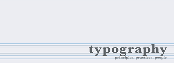
 This poster, designed by Craig Ward, perfectly sums up this lecture topic. Following on from my previous blog on Modernism, we have been looking at the issue of neutrality in typography. Modernism is all about form following function. The function of typography is to be read, therefore nothing in the form of the typography should detract from this.
 The typographer Beatrice Warde had very strong opinions on this subject. In her essay "The Crystal Goblet" she writes that typography needs to be transparent or invisible, with all of the focus on the message of the writing. She believed that typography should be unnoticed, and must be looked through, not at. She was strictly against frills and unnecessary detail or decoration. She wrote: "There is nothing simple or dull in achieving the transparent page. Vulgar ostentation is twice as easy as discipline." She also wrote that these are things that typographers need to respect and adhere to in their role.
Josef Muller-Brockmann thought that maths was the solution to systematic and rational typography. He believed that grid systems were the answer to ordering typography for three particular reasons:
Economical - problems can be solved in less time and for less money when using the grid.
Rational - simple and complex problems can be solved in a uniform and characteristic style.
Mental attitude - if typography is presented systematically and clearly, it exudes our social responsibility and will contribute to the cultural state of society.
He believed that good design and typography had an extremely high purpose and potentially a huge impact on society. He said "the desire to bring order to the bewildering confusion of appearances reflects a deep human need".
The most famous typeface to portray neutrality, and which is probably the most invisible in our culture is of course Helvetica. This is a typeface that we see everywhere in our day to day lives, and are likely to not even notice anymore.
I think that neutrality is important in typography in certain instances. For example, Helvetica is used a lot on signage, where I think it would be inappropriate to use anything else but a neutral, plain typeface, which does not distract. Similarly with books or certain important and information based texts, I have to agree with Beatrice Warde, in the way that the typeface in which the writing is set should not be noticed as you are reading it, and that the message must be the thing that you are focussing on.
I don't always agree with neutral or invisible typefaces however. Helvetica is used for the brand logo on several companies. I am not sure I agree that this is the most effective typeface for communicating a brand as it is so neutral and something we are so used to seeing. I don't think it could well communicate the personality and traits of a brand, or particularly differentiate it from any other one that uses Helvetica. I also think that there is a time and a place for decorative typography. Typography for me can be functional, or it can be used as an art form and I think that there are different sets of rules for both, depending on their particular purpose or function.
http://gmunch.home.pipeline.com/typo-L/misc/ward.htm
http://www.wordsarepictures.co.uk/


No comments:
Post a Comment